



What responsive web design is
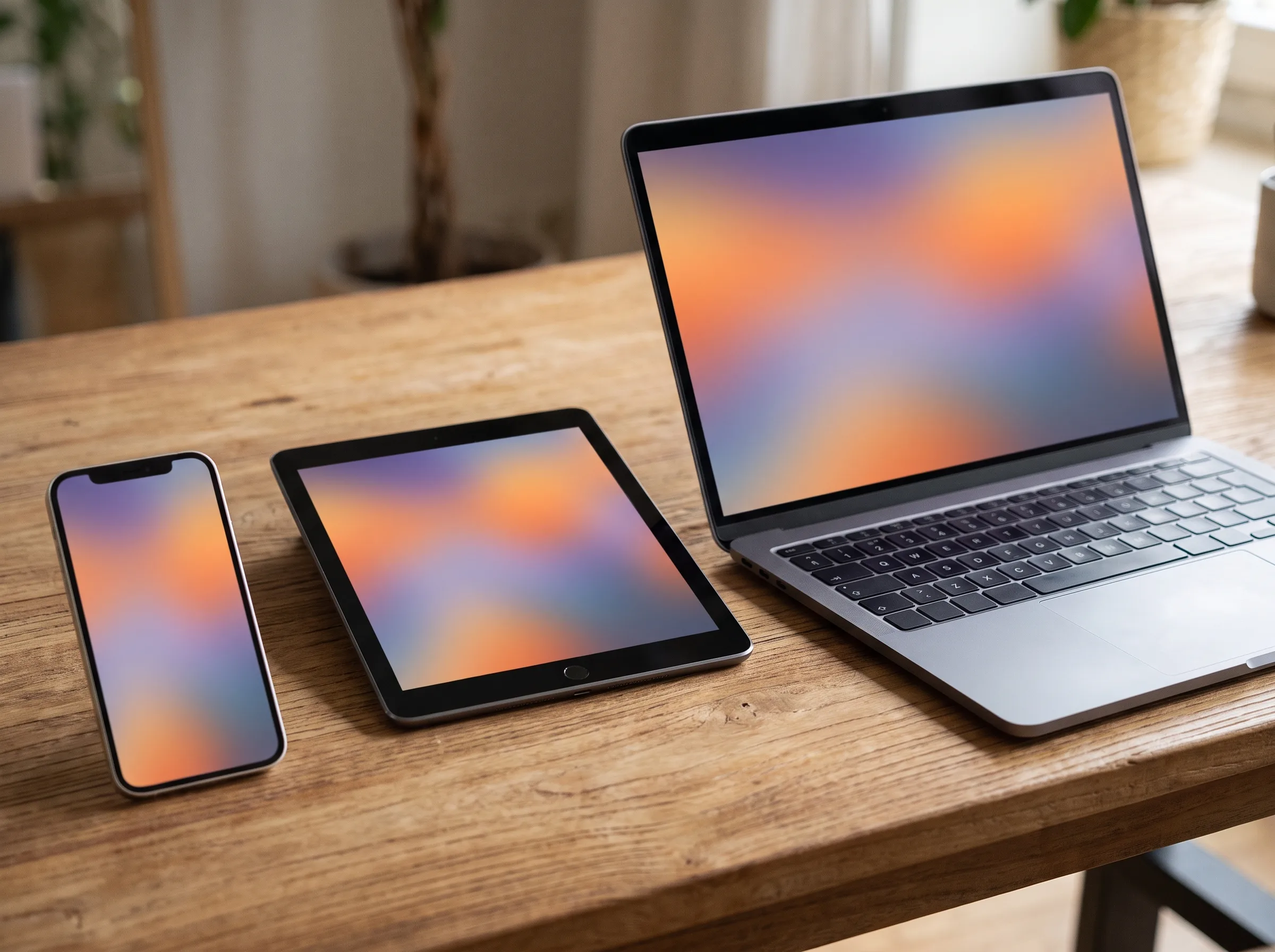
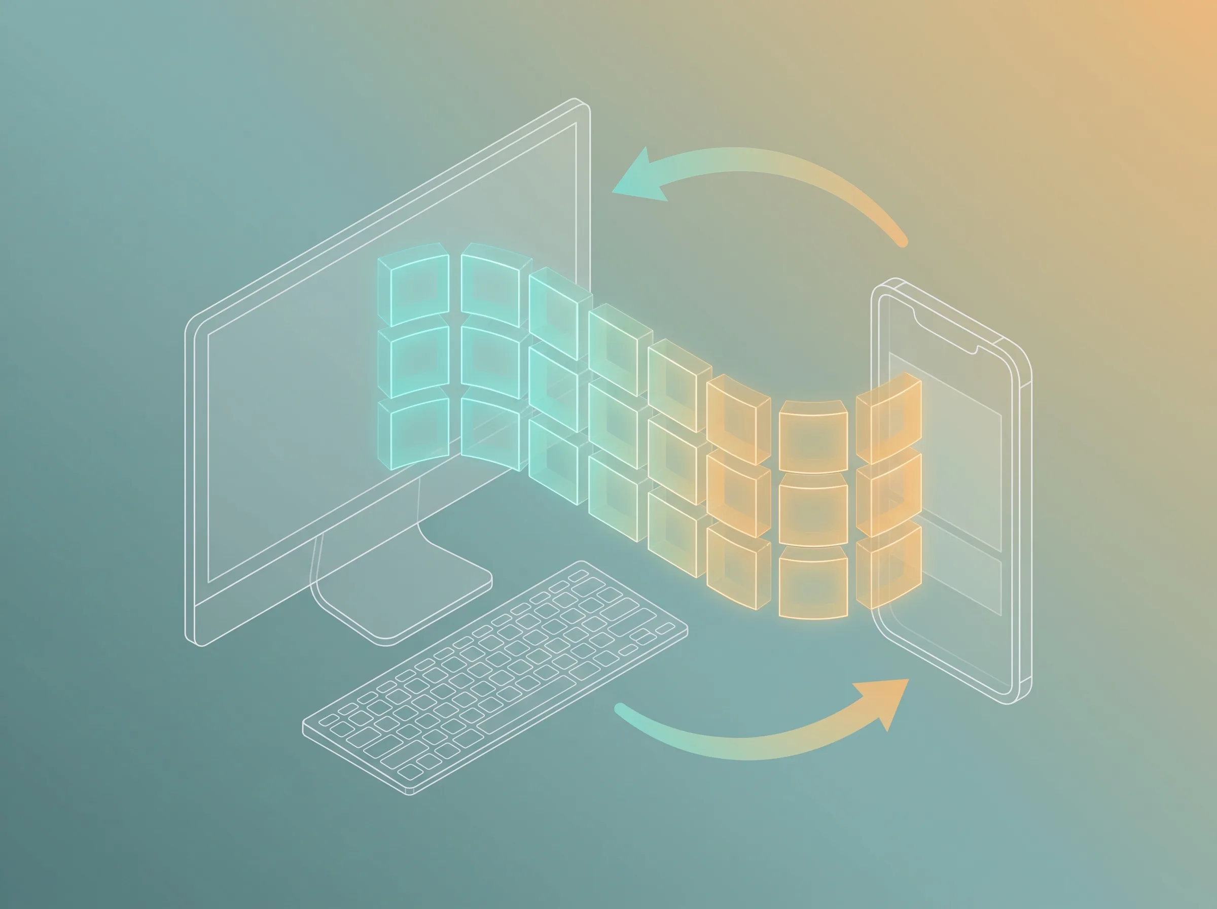
Responsive web design builds one website that fits every screen. The same site adjusts itself for a phone, a tablet, or a desktop.
There is no second mobile site to build or maintain. You have one set of content and one URL. That keeps things simple for you and for Google.
Most people now browse on their phones. So your site has to look and work well on a small screen. Responsive web design makes that happen.
We take a mobile-first approach. We design the phone view first. Then we scale the layout up for larger screens.
Why mobile-first responsive design matters
A responsive site meets customers wherever they are. They might visit from a phone on the bus, or a laptop at home. The experience feels right either way.
Google recommends responsive web design. It also uses mobile-first indexing. So a strong mobile-first layout supports your search rankings.
One responsive site is easier to manage. You update content once, and it appears everywhere. That saves time and avoids mistakes.
A good responsive design also lifts conversions. When a site is easy to use on any device, more visitors get in touch or buy.
Responsive layout, fluid grids and breakpoints
Fluid grids and flexible layouts are the core of responsive design. Content rearranges itself across screen sizes as the viewport changes.
Fluid grids, CSS media queries and relative units
We use CSS Grid and Flexbox with relative units to build a responsive layout that flows. CSS media queries set the rules for each screen size, and container queries let components adapt to their own space. A correct viewport meta tag makes it all work on a smartphone.
Breakpoints control when the layout shifts. A breakpoint is a screen width where the design adapts. We plan them for common devices.
- Mobile (up to 768px): A single column with stacked, easy-to-tap navigation.
- Tablet (768px to 1024px): A two-column layout with a compact menu.
- Desktop (1024px and up): A multi-column layout with full navigation.
Flexible images for every screen size
Adaptive images and flexible images play a part too. We serve smaller images to small screens across mobile, tablet, and desktop. That keeps pages light and fast on mobile data.
Touch optimisation, navigation and mobile-friendly usability
Phones use fingers, not a mouse. So touch targets need to be large and well spaced. We size every button and link for comfortable tapping.
Forms get the same care. We use clear labels and simple fields. On mobile, that difference is huge.
We also keep navigation simple. A tidy menu helps people find what they need on any device. Good usability keeps them on the page.
Cross-browser and cross-device testing
A layout can look perfect in one browser and break in another. So we test widely.
We check the site on real iOS and Android devices. We test major browsers like Chrome, Safari, and Firefox. And we test on slower networks to confirm it still loads well.
We test for accessibility too. A responsive site should work for everyone, including people using assistive technology.
Page speed and user experience across every device
Responsive web design is about speed as well as layout. A site that adapts but loads slowly still frustrates users. Good page speed is part of a mobile-friendly user experience.
We optimise images and load only what each device needs. We keep CSS and JavaScript lean. The result is a fast, smooth experience on any screen.
Fast pages also help your SEO. Speed is part of Google's Core Web Vitals, which feed into rankings.
Why choose 7Arx for responsive web design
We design mobile-first and test on real devices. Your site will look sharp and work well from phone to desktop.
We build clean, flexible layouts that are easy to update. And we tie every design choice back to your goals: more enquiries and more customers across Brisbane.